SharePoint Visifire Charting with Custom List Data
 Visifire is a set of data visualization components powered by Microsoft Silverlight which let you create and embed visually stunning animated Silverlight Charts within minutes.
Because it is a pre-compiled Silverlight control, the Visifire component and JavaScript library can be easily uploaded to a SharePoint document library and then used on a SharePoint page through a standard Content Editor Web Part. In fact, it doesn’t take long to imagine a scenario when a user might want to create an entire dashboard using these charts (see the bottom of this article for an example).
The purpose of this article is to describe the process for creating a dashboard of Visifire charts and to present a sample JavaScript library for accessing and working with both SharePoint list data and the creation of the markup required to render the Visifire charts.
For the purposes of this article I will be using a single SharePoint list containing proposed project data containing fields such as project cost, project benefit, and project type. Creating a Visifire chart from SharePoint list data can seem difficult at first but becomes much easier when using JQuery to access and massage the data. I will cover the following steps:
- Set up the web part page with the correct javascript references and placeholders for the charts.
- Retrieving SharePoint List Data using JQuery
- Summarizing the data with JavaScript and JQuery
- Building the XML for the Visifire charts.
Listing 1: Content Editor Web Part Code
 <script type="text/javascript"
src="Visifire2.js"></script>

<script type="text/javascript" src="My.Dashboard.Chart.js">
</script>


<h3>Visifire Chart</h3>
<table>
  <tr>
    <td><div id="VisifireChart1"></div></td>
    <td><div id="VisifireChart2"></div></td>
  </tr>
  <tr>
    <td><div id="VisifireChart3"></div></td>
    <td><div id="VisifireChart4"></div></td>
  </tr>
  <tr>
    <td><div id="VisifireChart5"></div></td>
    <td><div id="VisifireChart6"></div></td>
  </tr>
</table>
Setting Up
To get set up for this solution, create a new document library called Dashboards (you can name it whatever you want).
Download the Visifire control, extract the contents and upload the Visifire2.js and SL.Visifire.Charts.xap files to your document library.
Create a blank text file called My.Dashboard.Charts.js and upload this file to your document library.
Create a Web Part Page in your document library (I selected the Full Page, Vertical layout).
Add a Content Editor Web Part to the page and open the source editor. Add the code from Listing 1 into the source editor. Note: Each of the <div /> tags is for a separate chart to be explained later.
Exit edit mode. You should now have a blank page.
Next, we need the ID’s of the custom list and the view. Navigate to your list and change to the view containing the fields needed to be displayed in your dashboard. If a view doesn’t yet exist that contains all the fields you need, create a new view. On the View menu, select ‘Modify this View’. Copy the URL to the clipboard and go to the URL Decoder page. Paste in your URL and click Decode. Save the List ID and the View ID for later:
List={2A09E4CF-DEC3-4AC7-B846-E0C9E9170001}&View={4EFB1CFC-C60B-4D2B-8266-37A1D12C98C1}&Source=http%…
Retrieving SharePoint List Data using JQuery
I my case I am using a single list and summarizing it in different ways to generate multiple charts on a single page. The first step is to ensure the JQuery library is referenced in the page. Right-click on the page and ensure that the following is included somewhere in the page:
<script type="text/javascript" src="/_layouts/jquery-1.3.2.min.js"></script>
If JQuery is not referenced you’ll need to add it to your Content Editor Web Part.
The next step is to use JQuery to retrieve your SharePoint list data. I followed the steps from Jan Tielens blog on querying SharePoint list items with JQuery to get started. Then I started building up a simple JavaScript library for my page to use. Open the My.Dashboard.Chart.js file in your favorite text editor and add the following code:
     $(document).ready(function() {
        var soapEnv =
            "<soapenv:Envelope xmlns:soapenv='schemas.xmlsoap.org/soap/envelope/'> \
                <soapenv:Body> \
                     <GetListItems xmlns='schemas.microsoft.com/sharepoint/soap/'> \
                        <listName> {  Paste Your List ID Here } </listName> \
                        <viewName> { Paste Your View ID Here } </viewName> \
                        <viewFields /> \
                    </GetListItems> \
                </soapenv:Body> \
            </soapenv:Envelope>";

        $.ajax({
            url: " [ add your site URL here ] /_vti_bin/lists.asmx",
            type: "POST",
            dataType: "xml",
            data: soapEnv,
            complete: processResult,
            contentType: "text/xml; charset=\"utf-8\""
        });
    });
The code above will execute when the page loads and will submit a SOAP request to the SharePoint lists web service. When the web service call completes, the processRequest method will be called.
Let’s add a stub method for processRequest just so you can see what is going on behind the scenes and so we can see the names of our fields when they are returned from the web service:
     function processResult(xData, status) {
        var listData = $(xData.responseXML);
        var dataPoints = '';
        var chartXmlString = '';
        }
Save your .js file back to the document library and then open your web part page. Fire up Fiddler and then refresh the page. You should see an entry with a Status of 200 and a URL containing /_vit_bin/Lists.asmx:
Double-click on the row and the select the XML tab in the bottom-right pane of the window. Here you can see the actual XML returned by the web service. Take a note of the field names you need to use for your charts. Most of the field names will begin with “ows_”. We’ll use these field names to summarize our data. Before we can do that however, we need a couple of JavaScript functions to summarize the data for us and generate the XML required by Visifire to render the charts.
     function renderChart(xaml, divId) {
        var vChart = new Visifire2("SL.Visifire.Charts.xap", 450, 350 );
        vChart.setDataXml(xaml);
        vChart.render(divId);
    }
The renderChart() method takes in the xml generated below and uses the render() method from Visifire to create a chart in the specified <div/> tag.
function getGroupedDataPoints(listData, groupByField, groupType, valueField, insertTotal) {
var valueArray = new Array();
var keyArray = new Array();
$(listData).find("z\\:row").each(function() {
var myKey = $(this).attr(groupByField);
if (jQuery.inArray(myKey, keyArray) == -1) {
keyArray[keyArray.length] = myKey;
valueArray[keyArray.length] = 0;
}
switch(groupType) {
case 'Count':
if (valueArray[jQuery.inArray(myKey, keyArray)] == null || isNaN(valueArray[jQuery.inArray(myKey, keyArray)])) {
valueArray[jQuery.inArray(myKey, keyArray)] = 0;
}
valueArray[jQuery.inArray(myKey, keyArray)]++;
break;
case 'Sum':
var val = $(this).attr(valueField);
if (val != null && !isNaN(val)) {
if (valueArray[jQuery.inArray(myKey, keyArray)] == null) { valueArray[jQuery.inArray(myKey, keyArray)] = 0; }
valueArray[jQuery.inArray(myKey, keyArray)]+= parseFloat(val);
}
break;
default:
break;
}
});
var dataPoints = "";
var totalValue = 0;
for(var i=0; i<keyArray.length; i++) {
var label = keyArray[i].replace("&", "&");
dataPoints += '<vc:DataPoint AxisXLabel="' + label + '" YValue="' + valueArray[i] + '" />';
totalValue += valueArray[i];
}
if (insertTotal) {
dataPoints = '<vc:DataPoint AxisXLabel="Total" YValue="' + totalValue + '" />' + dataPoints;
}
return dataPoints;
}
The getGroupedDataPoints() function performs the summarizing of the data when given a field to group by, the type of grouping to perform (either 'Sum' or 'Count') and whether or not to include an additional total column in the data. The function returns a set of VisiFire DataPoint xml elements that will be used to generate the chart.
     function getXaml(title, chartType, dataPoints) {
      var chartXmlString = ''
      +'<vc:Chart xmlns:vc="clr-namespace:Visifire.Charts;assembly=SLVisifire.Charts" Width="450" Height="350" BorderThickness="1" BorderBrush="Silver" Theme="Theme1" Watermark="False" >'
          +'<vc:Chart.Titles>'
              +'<vc:Title Text="' + title + '" FontSize="16" FontFamily="Trebuchet MS" FontWeight="Bold" />'
          +'</vc:Chart.Titles>'
          +'<vc:Chart.AxesY>'
              +'<vc:Axis AxisType="Primary" />'
          +'</vc:Chart.AxesY>'
          +'<vc:Chart.Series>'
              +'<vc:DataSeries RenderAs="' + chartType + '" AxisYType="Primary" >'
                  +'<vc:DataSeries.DataPoints>'
                      + dataPoints
                  +'</vc:DataSeries.DataPoints>'
              +'</vc:DataSeries>'
          +'</vc:Chart.Series>'
      +'</vc:Chart>';
        return chartXmlString;
    }
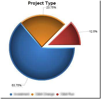
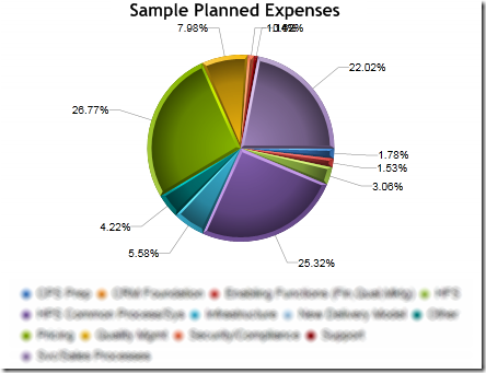
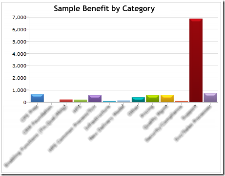
The getXaml method generates the XML required to complete the chart. Simply provide a chart title, chart type and the set of data points and the rest is done for you. The getXaml function with allow you to create charts like the following:
Now that the functions are all in place for formatting our web service data into Visifire charts, we need to call the methods to make all the magic happen. Let's go back to our processResult() method:
     function processResult(xData, status) {
        var listData = $(xData.responseXML);
        var dataPoints = '';
        var chartXmlString = '';


        dataPoints = getGroupedDataPoints(listData, 'ows_Category', 'Sum', 'ows_Expense', false);
        chartXmlString = getXaml('Planned Expense by Category', 'Pie', dataPoints);
        renderChart(chartXmlString, 'VisifireChart1');

        dataPoints = getGroupedDataPoints(listData, 'ows_ProjectType', 'Count', null, false);
        chartXmlString = getXaml('Project Type', 'Pie', dataPoints);
        renderChart(chartXmlString, 'VisifireChart3');

        var dataPointsStandard = getGroupedDataPoints(listData, 'ows_Status', 'Sum', 'ows_Expense', true);
        var dataPointsType2 = getGroupedDataPoints(listData, 'ows_Status', 'Sum', 'ows_ExpenseType2', true);
        chartXmlString = getTwoSeriesXaml('Standard vs. Type 2 Projects', 'Standard', dataPointsStandard, 'Type 2', dataPointsType2);
        renderChart(chartXmlString, 'VisifireChart5');

    }
Ok, so if you are actually still following along with me—congratulations! You get an added bonus. You’ll notice a new method in there, getTwoSeriesXaml(). Visifire supports graphing of multiple series. Here’s the code for the getTwoSeriesXaml function:
     function getTwoSeriesXaml(title, seriesATitle, seriesADataPoints, seriesBTitle, seriesBDataPoints) {
      var chartXmlString = ""
      +'<vc:Chart xmlns:vc="clr-namespace:Visifire.Charts;assembly=SLVisifire.Charts" Width="450" Height="350" BorderThickness="1" BorderBrush="Silver" Theme="Theme1" Watermark="False" >'
          +'<vc:Chart.Titles>'
              +'<vc:Title Text="' + title + '" FontSize="16" FontFamily="Trebuchet MS" FontWeight="Bold" />'
          +'</vc:Chart.Titles>'
          +'<vc:Chart.AxesY>'
              +'<vc:Axis AxisType="Primary" Prefix="$" />'
          +'</vc:Chart.AxesY>'
          +'<vc:Chart.Series>'
              +'<vc:DataSeries RenderAs="Column" AxisYType="Primary" LegendText="' + seriesATitle + '" LabelEnabled="True">'
                  +'<vc:DataSeries.DataPoints>'
                      + seriesADataPoints
                  +'</vc:DataSeries.DataPoints>'
              +'</vc:DataSeries>'
              +'<vc:DataSeries RenderAs="Column" AxisYType="Primary" LegendText="' + seriesBTitle + '" LabelEnabled="True">'
                  +'<vc:DataSeries.DataPoints>'
                      + seriesBDataPoints
                  +'</vc:DataSeries.DataPoints>'
              +'</vc:DataSeries>'
          +'</vc:Chart.Series>'
      +'</vc:Chart>';
        return chartXmlString;
    }
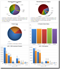
The final step is to save your JavaScript file back to SharePoint and refresh your page (be sure to use Ctrl+F5 to ensure you have the latest version of all your files). Here’s my final dashboard; click for the full size version. I’d love to see what you can come up with.


