Spinning-in-Control
In my previous blog post I talked about how easily you could achieve a spinning/rotator functionality in Silverlight with existing controls. I promised that I would come back with a more reusable solution, so here it goes.
A more organized attempt at spinning...
One of the biggest issues I ran into, as with designing any generic control, was trying to keep the API simple while adding both basic Numeric Up Down functionality and ability to navigate through custom items. To workaround that in a clean fashion I decided to split the two into two completely different controls and leverage the support of two very distinct features in Silverlight, RangeBase and ItemsControl. My team-mate, David, suggested that I could use ListBox instead to use its selection functionality and I would like to try that next.
So here is what I have.
NumericUpDown
The common features of a Numeric Up Down control...
- Support for keeping value within a range
- Interval to increment and decrement values and
- An initial starting value.
Since RangeBase does this by its very design and enforces the range via coercion, I decided to outsource all that responsibility to it and pretty much just added the buttons and the event handlers to do the right thing when the user clicks on the respective controls. Since RangeBase has two options for intervals, large change and small change, I have allowed for the user to update the value using either of those change intervals.
The anatomy of the NumericUpDown is pretty similar to that of the Slider control except that this is missing the track and the thumb and has a TextBox in the template instead. The Text property of the TextBox and the RangeBase Value are maintained in sync.
Usage
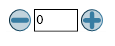
<spin:NumericSpinner x:Name="NumericRangeBaseSpinner" Value="0" LargeChange="1" Minimum="-100" Maximum="100" />
With that usage, here is how the NumericUpDown control looks like with its default template.
Note:
I am only using the LargeIncrease buttons in the default template to keep things simple and focused. You could easily add the small increase buttons and convert this into a paging control or a seek control on the MediaElement to change tracks in the MediaElement. Just set the LargeChange to be the Maximum amount and the RangeBase coercion will take care of the rest. Use SmallChange to perform the regular up/down. You can change the layout to add or remove any of these buttons to meet your requirements. It is pretty flexible!
General Rotator/Spinner
This control was born out of the need to browse through items in a collection, one at a time. It is very much the like the ListBox example I used in my previous blog post where I make the viewing area just big enough to accommodate the selected item only.
To summarize the features...
- View an object in an collection.
- Bind to the collection of objects:
- specified via a DataSource
- specified inline in XAML
- Navigate through the items in the collection
- Provide a DataTemplate that displays the object in a desired way.
Several scenarios come to mind: Slide Shows, Paging Controls, input choices on a form like months in a year or days of the week, numeric up/down and many more.
To achieve the inline declaration of objects I decided to leverage the built-in feature in ItemsControl that has the Items property as Content.
What does a Spinner control give you?
- Current item displayed using a DataTemplate and backed by a ContentPresenter in the control template.
- Navigation support for previous and next items using Buttons.
- Navigation hooks to get to the first and last elements in the collection using Buttons.
TODO: Need to expose the object being currently displayed and I am toying with the idea of basing the third flavor on a ListBox control to use the selection goodness as I mention above.
Usage:
Spinning through the days of the week
This sample shows how to bind a Spinner to the days of the week and display the day in the format you choose. I chose to start with Thursday as the week to start from by setting the CurrentItemIndex property to be 3. You can hit the last or first buttons to go to Sunday or Monday respectively or use the previous and next buttons to navigate in smaller steps.
<spin:Spinner x:Name="MySpinner" CurrentItemIndex="3">
<spin:Spinner.CurrentItemTemplate>
<DataTemplate>
<Border Height="27" BorderThickness="2" BorderBrush="Black" CornerRadius="2">
<TextBlock Text="{Binding Text}" HorizontalAlignment="Center"/>
</Border>
</DataTemplate>
</spin:Spinner.CurrentItemTemplate>
<TextBlock Text="Monday" />
<TextBlock Text="Tuesday" />
<TextBlock Text="Wednesday" />
<TextBlock Text="Thursday" />
<TextBlock Text="Friday" />
<TextBlock Text="Saturday" />
<TextBlock Text="Sunday" />
</spin:Spinner>

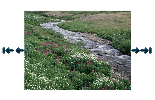
Spinning through Images: Slide Show!
In this example, I wanted to display the true power of the CurrentItemTemplate property. I pass the URL paths to the images in my application and bind the Image's Source property in the DataTemplate to that path. All that I need to do then is hit run in Visual Studio. Yes, yes, it does not have the standard SlideShow goodness like auto-play, round-robin etc. but it is a decent start and those hooks could be added externally since the CurrentItemIndex property is exposed for manipulation. In a real world scenario you would set the ItemsSource property to the collection of business objects and let the DataTemplate work the magic.
<spin:Spinner x:Name="MyPagingSlideShow" >
<spin:Spinner.CurrentItemTemplate>
<DataTemplate>
<Image Source="{Binding Text}" />
</DataTemplate>
</spin:Spinner.CurrentItemTemplate>
<TextBlock Text="/Images/Creek.jpg" />
<TextBlock Text="/Images/Dock.jpg" />
<TextBlock Text="/Images/Forest.jpg" />
<TextBlock Text="/Images/Garden.jpg" />
<TextBlock Text="/Images/Tree.jpg" />
<TextBlock Text="/Images/Waterfall.jpg" />
</spin:Spinner>
Caveat!
David brought this point up and I agree with him. The paradigm of specifying the items inline does not scale too well if you specify a large number of UIElements inline since ItemsControl does not support virtualization. ItemsControl will try to load all those elements when a request for that page is made. So sticking to specifying lightweight business objects like strings and URIs would be the way to go here and let the DataTemplate take care of the presentation.
Wrapping up...
That's all I have for now. I do hope these controls serve you well and I would love to hear feedback and feature suggestions on the design, implementation and more so do let me know what you think!
Thanks!
Kirti