Designing Touch Targets
A common problem in Windows Phone app design is the poor use of touch targets, i.e. the area of the screen which responds to user interaction (usually a tap). When designing on the emulator, this is easy to overlook as the mouse gives a very precise ‘touch’. However, when the application is run on a device the user’s finger or thumb is normally used to tap on the screen. This is the ‘fat finger’ problem and can mean that items are difficult to hit accurately (user accidentally taps the item next to the desired one) or items that can be tapped on don’t always respond.
SIZE AND SPACING
When touch targets are very small and close together, the user has to take care when tapping to make sure that they accurately hit the item they want. This can be very frustrating and slows down the interaction with the app.
For more detailed guidance for designing touch targets, visit Interactions and Usability with Windows Phone.
However, here is a simple walk-through you can try out yourself for an idea of how this works in practice.
Let’s use the ListPicker control from the Silverlight Toolkit for Windows Phone as an example.
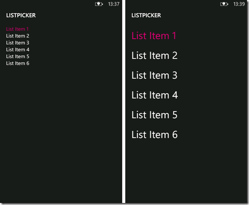
On the left is the full screen view where the list uses default TextBlocks to display the items. On the right is the same list, but this time with the FontSize set to “40” and the Margin set to “0,12”.
Here’s the code for the ListPicker:
Code Snippet
- <toolkit:ListPicker Header="FullScreen ListPicker" ExpansionMode="FullscreenOnly">
- <sys:String>List Item 1</sys:String>
- <sys:String>List Item 2</sys:String>
- <sys:String>List Item 3</sys:String>
- <sys:String>List Item 4</sys:String>
- <sys:String>List Item 5</sys:String>
- <sys:String>List Item 6</sys:String>
- <toolkit:ListPicker.FullModeItemTemplate>
- <DataTemplate>
- <StackPanel Orientation="Horizontal">
- <TextBlock Text="{Binding}" FontSize="40" Margin="0,12"/>
- </StackPanel>
- </DataTemplate>
- </toolkit:ListPicker.FullModeItemTemplate>
- </toolkit:ListPicker>
While items in both lists are easy to hit with a mouse on the emulator, the list items on the right are much easier to tap accurately on the device. Test this by holding the device in one hand and using your thumb to pick from the list.
SCOPE
Sometimes when tapping on items in a list the application does not respond. Despite the item itself appearing large enough to be an easy hit target, in practice the user has to tap several times to get the item to action.
The simple rule is to place the tap event at the highest meaningful control level. Let's look at an example. Suppose our list item uses the following code:
Code Snippet
- <ListBoxItem toolkit:TiltEffect.IsTiltEnabled="True" >
- <StackPanel Orientation="Horizontal">
- <Image Grid.Column="0" Width="80" Height="80" Source="books.jpg" Margin="16"/>
- <StackPanel Grid.Column="1" Margin="0">
- <TextBlock Text="TEST TITLE 1" FontFamily="Segoe WP Black" FontSize="48"/>
- <TextBlock Text="test sub title 1" FontSize="32" Margin="0,-12" Tap="TextBlock_Tap" />
- </StackPanel>
- </StackPanel>
- </ListBoxItem>
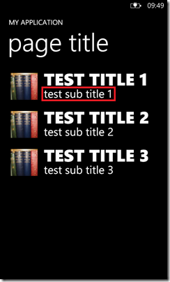
This means only a small part of the ListBoxItem is actually listening for the tap event, but this is not obvious to the user. The red boxed area below shows the part of the item the user has to tap on:
To make the list items feel more responsive, move the tap event up to the top level component of the ListBoxItem:
Code Snippet
- <ListBoxItem toolkit:TiltEffect.IsTiltEnabled="True" Tap="ListBoxItem_Tap">
- <StackPanel Orientation="Horizontal">
- <Image Grid.Column="0" Width="80" Height="80" Source="books.jpg" Margin="16"/>
- <StackPanel Grid.Column="1" Margin="0">
- <TextBlock Text="TEST TITLE 1" FontFamily="Segoe WP Black" FontSize="48"/>
- <TextBlock Text="test sub title 1" FontSize="32" Margin="0,-12"/>
- </StackPanel>
- </StackPanel>
- </ListBoxItem>
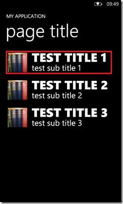
This now means the tap event now more closely matches the visual area of the list item as shown in red below:
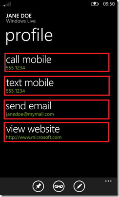
This can apply to other areas too. The image on the right is a sample contact from the People hub, again with red boxes to mark out the touch target area for each key/value pair. Here the tap action does not only apply to the contact detail, instead the touch target area extends to include the associated heading.
By carefully considering the best size, spacing and scope for the tap event, the application will feel more responsive and easier to use.
Written by Fiona Bell


